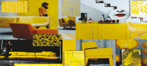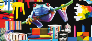
Milou Ket Styling & Design, located in Purmerend in the Netherlands markets the 2015/2016 edition of INTERIORS, the trend book of Milou Ket, famous Dutch interior stylist and international trend forecaster. The book is theming the future as shown below
INTRODUCTION In this new INTERIORS, edition 2015 / 2016, the most influential international themes are shown. The book contains both summer and winter themes. There are six themes featured, all with their corresponding colour cards. For weavers, printers and spinners we there is a special box with colours, meant for the interior, contract and hospitality market, where cotton yarns are dyed after specification. This is a separate product, but there are also extra skeins available on request to go with this book. Besides that, there is a list of the compatible Pantone® cotton colours.
Every theme is shown with it’s corresponding colour card, plus more than 100 inspiring materials that match the themes in colour and character.At the end of the book is a list of sources, designers and manufacturers that are featured in this INTERIORS book.
Colour has been accepted in the interior. Neutral colours are the bases to add colours in different intensities. The pastel colours will be the most important for textiles and accessories. The first theme “Pop-Up Brights” shows bright and primary colours, often against a white, neutral or black background. The second theme ”Soft Focus” is partly contemporary, partly traditional romantic and vintage, in fresh pastel colours. “Ethni Craft” is the third theme, based on handi craft, from different corners of the world. In “Nordic by Nature” the emphasis is on cool neutrals, now combined with dusty pastel colours to meet the demand for more colour. Exotic nature and jungle fever take a central role in the theme “Second Nature” in colours inspired by nature, combined with some bright accents. In the last theme “Opulent Glamour” we are inspired by our cultural heritage, and add luxurious materials, in deep basic colours and exiting accent colours. Metallics are important. Different styles are mixed.
Colour has become very important over the last few seasons. This will be continued, but the pastels will be the most important. In this first styling direction we see slightly faded bright colours, with a touch of vintage, but also primary colours in the style of the Dutch painter Mondrian.
Art is an important source of inspiration, for instance Pop Art, the art of Sonia Delauney and Vasarely with their colourful effects. These bright colours are mainly meant for accessories, but we see them also applied for walls.
Geometry, and painterly effects such as blending watercolours are important. Mistakes from the computer are used in prints. Everything is light and airy. Therefor we will see a lot of metal wire furniture. Sometimes the inside of a bowl or vase is very colourful. Ceramics and glass will be important. Opposed to cool materials we will see warm, textured materials such a felt and wool to balance the effect. Black is often used as a good background colour and in outlines to make the colours shine.
COLOURS: For this theme we see a range of bright colours, but slightly faded for a vintage effect. They work best in combination with black or neutral colours such as beige and grey. They are also combined with old wood. As colours we see Bright Red, Bright Pink, Bright Orange, Warm Yellow, Bright Green, Bright Cyan, Cobalt Blue and Purple. Black is an important background colour, and is also used for outlines. White as a combination colour gives the necessary freshness.
2. SOFT FOCUS This theme is partly contemporary, partly romantic, feminine, classical and traditional. The range of the pastel colours will be the most important of the season. Nature plays an important role, but in a refined way. We see old-fashioned floral patterns, old engravings and poetic images. It has often a touch of glamour because of the combination with mirrored surfaces and the use of metallics and sateen. The use of gradient colours is important as well. The volumes are rounded and friendly. Sometimes a touch of an even brighter colour will be applied. Old handicraft and new techniques are combined. We will see a lot of lace and matte/ shine effects, open work and laser-cut materials in an opaque/ transparent interpretation. It is mostly light hearted, elegant and feminine. White is often used as a background colour, but we also see different shades of beige, for a recycled effect. Colours are combined for a gradient colour effect.
COLOURS : Fresh pastel colours prevail. The emphasis is on the range of pink shades. The colours are: Lipstick Pink, Pastel Pink, Salmon, Blush, Pastel Yellow, Mint Green, Soft Turquoise and Pastel Green. They are often combined with white for a fresh effect, but also with beige for a more antique and worn effect.
3. ETHNI CRAFT Products from all over the world find a place in our interiors as a souvenir from far-way places and our travels. We have become a kind of modern Nomads, travelling around and making our homes in various places. Regional Folk art is valued again. From refined Far Eastern ideas with flowers and birds, Chinese porcelain to Navajo Indian hand-woven blankets and Berber weaves.
With African wooden sculptures and masks, and Turkish applications and Kelim patterns. We also see interest in materials coming from the former colonies like Indonesia. The colours are warm and rich and combine well among each other.
Peacock is one of the most important colours and is combined tone-in-tone in different shades of blues and greens. Luxurious materials and almost forgotten hand-made techniques play a role. Warm red brown is the most important background colour. Also the English country side, and the forest in autumn colours are important with tweeds and checks.
COLOURS: The colours in this theme are warm and expressive. Red brown is the most important background colour and makes the range work. As colours we see Red Brown, Tomato Red, Copper, which acts also as a warm orange, Ochre, Aubergine, Light Peacock, Indigo Blue and Purple. All these colours combine well. Luxurious materials and almost forgotten techniques play a role to obtain a rich and warm look. Peacock will be one of the most important colours and will be used also for painted walls.
 4. NORDIC BY NATURE
In this direction we see Nordic influences from Scandinavia. Before this theme consisted only of neutral colours, but now some dusty pastel shades are added to meet the demand for more colour. Mostly the textures and decorative objects are inspired by nature, such as fossils, shells, seeds and a whole range of animals. Cold winter landscapes with snow, photo prints in black, white and shades of grey are important here. These neutrals and dusty pastels are sometimes combined with the anthracite grey, chocolate brown and black from the last theme, but only in small touches to add some accent and interest.
White is also an important colour, and comes to life, in fragmented and angular shapes. Laser cuts, and pleating give a shadowy effect.The neutrals are often the base and background colour, to be combined with the pastel colours. There is not much contrast in this theme. The metals are often aged, worn and oxidized. Hairy materials such as hides, furs and mohair are added for balance.
COLOURS : Besides several neutral colours we see some dusty pastel tones. As colours we see Beige, Soft Orange that can act as a colour or represents also a warm shade of wood. Pale Yellow, Dusty Pink and a Snow White, Ice Blue, Pearl Grey and Middle Grey. The anthracite grey, the brown and black from our last theme can be easily combined with this range, to add more accent and interest. White is also important and is combined with pleating to add shadow effects.
5. SECOND NATURE Nature is a very important source of inspiration. In this theme we see the emphasis on lush, exotic nature, tropical, with foliage and leaves, exotic flowers such as orchids, and parrots, parakeets, monkey’s, leopards, butterflies and insects. But also the underwater world is a source of inspiration, like lobsters and clams, fishes and corals. It is like jungle fever, or urban jungle. We see botanical influences as well, but in brighter colours than we have seen before. Besides some green shades and a khaki, there are some accent colours like a poisonous lime and a signal red. But also bright yellow and turquoise could be used as an accent. The former Arts and Crafts movement of William Morris in the United Kingdom meets a revival. His fabrics are still made. Flora and Fauna, but also the creatures from the sea with shells, corals and fishes is a source of inspiration. We see show cases and bell jars and we take plants into our homes
COLOURS: In this direction we see several green shades such as Khaki Green, Grass Green, Poisonous Lime. Besides that, two very bright colours, Hypnotising Pink and Signal Red. Also a bright turquoise and yellow from our other ranges could be well combined as an accent. Besides those, there are three water colours: Jade Blue, Lagoon Green and an Ocean Blue. Often white is used as a fresh background colour.
6. OPULENT GLAMOUR The rich historic paintings from the Dutch Golden Age are the source of inspiration for this colour theme in mysterious gem – and dark colours. The theme is traditional, based on an opulent cultural heritage, with rich metallic such as bronze, copper, tin and oxidized metals such a gold and silver. There is a kind of golden light over everything and colour comes to the forefront against a dark background. As colours we see Golden Yellow, Prune, Magenta, Peacock, Deep Night Blue and three basic colours such as a warm Chocolate Brown, Anthracite Grey and of course Black. The shapes can be simple, but mostly the materials are rich and luxurious. The shapes themselves can also be quite minimal. It can be contemporary, but it can be also more traditional and even baroque. Black and white will be continued. Circles and Spirals are popular motifs. Illustrations with a Surrealistic touch and engravings as well as the work of Cocteau, remain important.
COLOURS: In this theme the emphasis is on a range of dark colours, and colours that remind us of gems. Like a facet of a gem, their different facets radiate their own colours, mostly tone-in-tone. Peacock will be a very important colour and can be combined with turquoise and bright green from our bright colour range. As colours we see Golden Yellow, Prune, Magenta, Peacock, Deep Night Blue and three basic colours such as a warm Chocolate Brown, Anthracite Grey and of course Black. These dark colours can be used in combinations with other themes as well.